Wednesday, March 9, 2011

How to remove banding from a jpg?

I haven't got a clue. After trying everything recommended in every PS tutorial and every forum, and still without success, a conversation from the movie "Top Secret" comes to mind.

The manager, who was supposed to free an American musician from an East-German prison, visits him in his cell and says with a mournful face:
"Nick, I have tried everything. The embassy, the consulate..."
"Don't worry, there will be a solution."
"...the President, the CIA...."
"Don't worry, there will be a solution."
"... even the Marines. But I still can't make my wife have an orgasm."
"I told you not to worry. Here's the solution", the musician says and takes a huge box from under his bunk. The inscription reads: THE MIGHTY ANAL INTRUDER.

Anyway, the bottomline is that all jpgs with banding are fucked. No remedy.

Monday, February 14, 2011

Saturday, February 12, 2011

Good stuff on LIFE

Check out the LIFE magazin series about taking great pictures. I found it today and liked it very much. Full of good tips about triangular composition, leading the eye, and how to take photographs in Hitler's bunker.
Not kidding about the latter. What might be even more interesting than war correspondents studying blood stains on the Führer's sofa is that they included some of the original captions in the gallery, where the photographer describes what's on the film rolls. A good reminder that self-administration is as much of a part of photojournalism as is taking pictures. And how hellish it must have been to do this on typewriter... but then we all know that war is hell.

Tuesday, February 8, 2011

Selection criteria in photo competitions

My entries to the Portrait and People Contest - The Worldwide Photography Gala Awards made it into the second round (I suppose most of the participants did, because now it's time to pay for getting admitted into the further rounds - $75 in my case and I still don't know if my vanity is worth it). Since the only title I hold in photography is A.P.W.N.W.A.C. - A Photographer Who Never Wins Any Competition - the whole thing weren't worth a post. However, contrary to the majority of competitions, they were kind enough to describe their selection criteria. I find their list very useful - it's nothing new really, but aptly structured and clearly written. Enjoy.

1. What is the main thing we notice when looking at the image? (the primary visual impact of the viewer)

2. What are the main formal causes of this primary effect? It’s just the formal design or the subject? How do lines, shapes, tones, volumes, textures and patterns interact with the viewer?

3. Which was the intention of the photographer? Why would this photo be made and how would it be used?

4. Is there any creativity and innovation in the photo? What do we see as the most innovative and creative aspects?

5. Is there any meaning or any symbols underlying in the photo that give it a special meaning?

6. Finally, we analyzed the technique of the work:

6.1. Is the light (not the exposure) the right one in terms of direction and quality?

6.2. Is the camera angle the most appropriate?

6.3. Could the photo be improved by cropping it?

6.4. Does the depth of field and focus help to the visual impact?

6.5. Is the contrast the right one; should it be lowered or augmented?

6.6. Burn in or dodge parts of the image enhance the formal design of the image?

6.7. If some special technique (like Photoshop art filters, textures or color saturation) are used, does really help to the overall impact; does it add any special meaning or creative approach?

Friday, January 21, 2011

500px

500px.com is a photo site balancing between usual photo-sharing and a juried selection of photographs. Members can upload whatever they wish but the photographs will soon sink into oblivion unless they become really popular. All viewers can vote pro or contra on a particular image, but it's not mandatory to vote. The more votes an image receives, the less is the weight of a vote. In other words: the more popular an image becomes, the more votes it needs to proceed and finally stay in the top selection. Popularity votes are not to anyone's taste but at least every upload has a chance. I also like the easy-going and slightly ironic attitude of the founders. For example, if you upgrade your membership you don't become "pro" or "bronze" or "full" but - "awesome". (Quite an easy way to become an awesome photographer.) Their portfolio service doesn't offer too many gimmicks but what they provide is decently designed, bug-free and comes with an interface that's a pleasure to use. On the negative side, a great part of the chat goes in Russian and the site lacks a real community because there isn't any discussion forum. But for easy photo sharing with a little competition, the site is perfect.
Anyway, most of what's popular there is escapist-beauty-glam stuff (and I don't mean this in a dehonestating way because who wouldn't want to see nice things once in a while?). I had a hard time establishing myself since my "work" is mostly documentary-oriented with just a few attempts at fine art, but at last today one of my nudes got into the pool of most popular images.It's one from a 2009 shooting with model Ewelina in Cologne. Moreover, through my 500px portfolio I received an inquiry from a German gallery about buying this one. I hope it can be realised but in any case, isn't this the kind of email all photographers hope to find in their mailbox one day? At least it gave me good impetus to work the image over, having at last a real image in mind and not just the usual 900x600 pixel thumbnails.

Wednesday, January 19, 2011

SajtóFotó 2010 - Hungarian Press Photo Awards 2010

Sajtófotó, the annual Hungarian Press Photo Awards have always been criticized for being open to all but always won by the same insiders. It was welcomed news to hear that foreign photographers (Jan Sibik, Sam Steward, Filip Horvath from AP and Thomas Szlukovenyi from Reuters were invited this year so that the competition doesn't turn into the usual game called "I give an award to your protegé, you'll give one to mine". It was also hoped that the final selection will be more in line with the newest trends in photojournalism, especially with Sibik on the board.
The winners will be announced later today but here are a few thoughts about the third round (that's the pool from which the finalists were picked) in the portrait category, one in which I was very interested. The jury's discussions could be followed online.
I was amazed to see these to nearly similar images appear. When I saw this first I said wooow that's a good one. According to the caption, it shows a boy in front of his ruined home after his village was flooded in May. But like always, if something seems to be too good to be true then it usually is. Because here's the same boy again:
The jury quickly checked if the two shots were submitted by the same photographer (they weren't) and picked the second image. As I see it, it would have been more appropriate to reject both because one cannot shake off the feeling of the whole scene being staged and the boy coached. At least we spectators couldn't.
Then, there was the question of how much creativity is allowed in a portrait. This is a portrait of Béla Albertini, a renown photographer and university professor of photo aesthetics, photo journalism and photographic composition. As I see it, the photograph tries to convey the complexity of his character. It also makes reference to the art of photographic composition and maybe to analogue photography as well, since Albertini was a successful sociographic photographer himself in the old days. The jury didn't really know what to do with this until the Hungarian moderator asked the guest jurors (especially Stewart who is a photo editor at NPPA) if they would chose it for publication, to which they replied with a clear "no" on the grounds that it isn't a photo-journalistic portrait and was obviously post-edited. A good argument. However, in the years before we saw many heavily edited (but excellent) photographs among the winners of the portrait category, like this:
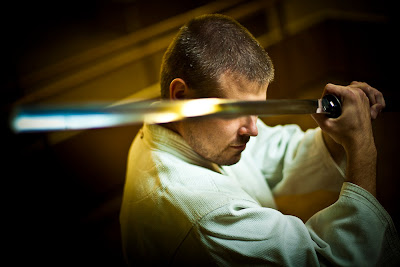
(Péter András Németh: Blind aikido master)
...or this:
(Árpád Kurucz: Thrillusionist, "Életbűvész")
So what's the way to take? I'm not saying that this picture should have been the winner but have some doubts about the jury's argumentation - are press photographers not allowed to think out of the box when it comes to conveying a subject's character and profession? After all, the guest jurors were involved to add a more forward-looking spirit in terms of photographic creativity to this competition.
Same here: the portrait of an actress. What do actresses do? They play different characters. To me, this photograph shows just that.

One of the jurors added with a laugh, "I like the woman but not the picture". Hell of an argument...

Stop press: here are the winners of the portrait category."Can't be wiped off", by Viktor Veres
There were many technically better ones than Veres' winning photograph but it's definitely an image in which expressivity, emotions and impact overrule any technical issues. One of course need to know the context: it was taken after the red mud catastrophy in October when a spill of toxic waste devastated two villages, killing several people and turning the countryside into a minor version of Chernobyl. Too bad that for anyone who doesn't know the context this could be a woman who just had tomatoes thrown at her face. Anyway, for us in Hungary this image has the potential to become a photographic icon. Well deserved.
Just as a footnote: this image had no title and no caption whatsoever in the competition, they where added at a later stage - when it was, on paper at least, not allowed. It's also interesting that it barely made it into the third round, scoring only 3 of 7 possible points (even my own photograph which was later rejected got 5 at that stage). But as said: well deserved, imo.

Hope, by Akos Stiller
This in an image that simply had to win: the Dalai Lama giving an interview to journalists in the House of Parliament. Big news for Hungary, but the news for the rest of the world is that even His Holiness has hair in his nose. At least photo critics will have a good reference when they argue that photographing faces from below and leaving reflections in eyeglasses are not necessarily flaws in a photograph. (Or maybe not?)

Fate, by M. Istvan Kerekes
"Two years old Klári lives in Transsylvania, sharing a mud house with three sisters and her parents. They almost lost everything in the floods two years ago." At least that's in short what the caption says. Very heart-wrenching and all and maybe I'm stupid but I'd expect from a finalist of a press photography competition to tell the story with the image, not only the caption. (By the way, Stiller and Kerekes have been among the finalists in 2008 and 2009 too. It's a small country, you know... and it's of course merely a coincidence that the overall winner ("grand prize for best achievement"):...

...works for the same online news portal like the jury member who stepped in at the last moment to replace a Slovakian juror who fell sick. Did I tell Hungary is a small country? Or maybe I'm being just... too Hungarian, genetically prone to see cronyism around every corner. In any case, this year didn't bing big surprizes: we have seen the same names win before, and before, and before that too.)

I can't understand why the competition is still not divided into professional and amateur categories: the few dozen "big shots" could still pat each other on the back in the pro category and let us lesser mortals compete outside their hallowed circles.

The bottomline is: if I was an aspiring young press photographer looking at the finalists for inspiration and new ways of photojournalism to explore, at least in the portrait category, I'd have a very hard time finding it. But the most painful thing about this awards is that if you a pro and win yet another time, it doesn't really matter; if you're an amateur and win, it doesn't help you either. The whole thing just doesn't look as good on a photographer's CV as it should, and probably not because Hungarian photographers lack talent or skills. Pity.

Link to the result page: http://www.sajto-foto.hu/2010/dijazottak

Wednesday, January 12, 2011

Opening old perspectives

Soon we will all photograph in 3D and merge videos with still shots and images will be no longer saved to memory cards but directly transferred to Facebook from the camera. Or so they say. then, returning to the very basics of visual arts can be quite inspirational in our quest for better photographs.

The world is satiated with good portraits and photographers are always on the look-out for new PS filters and add-ons and post-editing methods that would make a difference between their images and the rest. But let's forget editing for once and go back to basics.
Let's take the good old perspective as a creative tool. We tend to overlook it in our photographs as something basic and self-explaining. But deepening the perspective can increase the value of an already good photograph tremendously, and one doesn't even need CS5 for it.

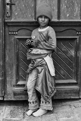
What made this come to my mind is a photo by Zoran Toldi.

A dilapidated door as background, bare feet on the threadbare cobblestones. All details match the portrait of a street urchin, and although the photographer shows just a small part of it it isn't too difficult to imagine the wider environment. A good shot just as it is.

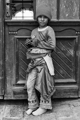
Truth is, I have altered the above image slightly. Here's the original:

As I see it, the photo would be good enough without that open window. However, by that little detail the photograph looks more airy and three-dimensional, since the perspective doesn't end at the door and let's the eye wander beyond it. If I compare the two I feel as if my eyes would bounce back from the close background in the first version. It looks so much better with the background opened up - the simple effect of using a deeper perspective.

To make the best use of this detail, a strong crop comes to mind. Looking at it from closer, the arches in the background start communicating with the curves on the door and on the subject's clothes:

Thinking it through, the final result could be a close-up portrait with a strong emotional content and many little geometric details delicately connected to each other: the arches with the curves on the cap, the carving on the door with the fingers, the circles in the iron grate with the round number (5) on the sweater, the brightness of the far background to the bright collar. But what really makes the music here is the deep perspective. One only needs a good eye to see this altogether, even subconsciously, and press the shutter.

Monday, January 10, 2011

Treasure in the trash: Vivian Maier on subba.hu

One might think the most fascinating about Vivian Maier's work is how she managed to take those awesome street shots. Or the fairy-tale story of discovering her work. Or the whole buzz around her in the street photographers' community.
All wrong.
The most fascinating about her is that she even made the jaw of virtual trash-collectors drop in awe. There's a dirty smelly little site on the Hungarian web called Subba.hu (subtitle: "everyday trash") which tiressly digs up the bowels of the net in its search for photographs of ugly people, videos of hilarious ways to die, in short: everything that's ridiculous and pathetic. Sometimes I check it up for inspirations.
And what do I see today? It says: "Vivian Maier: The Chicago nanny spent her free time walking the streets with her camera. More than hundred thousand negatives are waiting to be processed, her photographs are simply awesome." Now, one needs to know that if Subba were to grant the Academy Awards they'd give it to Two-girls-one-cup. Accordingly I expected some dreadful images, maybe badly processed ones or a sarcastic post to make fun out of the hype around Maier. To my surprise the site was indeed singing the praise of her work. Judged by the comments other readers were equally perplexed. Some of the comments are hilarious.

Dr. Otto Von Schnitzelpusskrankengescheitmeyer 2011.01.10. 08:17:05
This lady surely lived in a posh neighborhood. Or maybe she was just a squalor fetishist?
lebowski71 2011.01.10. 09:02:49
Never expected this stuff here :)
shitgun2 2011.01.10. 09:14:55
Phantastic shots, especially those with buildings, she has a remarkable feeling for lines and structures. I don't really like the sociographic images, they're all familiar but beautiful.
ReWriter · http://miazhogy.blog.hu/ 2011.01.10. 09:44:55
You see, people took their self-portrait in the bathroom mirror even then (3:57 in the video). But they had no site to upload them. :)
nevetőharmadik 2011.01.10. 09:56:37
Subba, are u sick? XD
Peter Blau 2011.01.10. 10:01:28
Try to take the same shots in Budapest today. Half of the subjects would file a complaint against the photographer for violating personality rights. The other half would ask for money and others would simply smash your camera :-)
Egyedi Nick (Carter) 2011.01.10. 10:03:54
@Peter Blau: Maybe she too paid for the photos :) Anyways they are good photographs indeed but there's plenty of the like on the net, just check deviant, and if you go to such a run-down neighborhood and find a good motif and have good equipment and aren't a total dud you can take similar images.
Rav Antal 2011.01.10. 10:11:39
So if she "walked the streets with her camera", where are the movies? Or did you just fuck up the translation of the word "camera"?
Wild Colonial Boy 2011.01.10. 10:14:00
"you can take similar images" Won't be easy without a time machine.
Wild Colonial Boy 2011.01.10. 10:17:00
It's correct to call a camera a camera in Hungarian, it just ain't usual.
Rav Antal 2011.01.10. 10:20:51
and how do you call a camera?
Cpt. Flint 2011.01.10. 10:20:58
The Americans are lucky, these photographs are not only artistically great but have great documentary value as well.
Cpt. Flint 2011.01.10. 10:22:26
motion picture recording camera :)
Cpt. Flint 2011.01.10. 10:41:56
@Wild Colonial Boy: yeah and still camera :o) R2D2 is a motion picture recording camera when it's recording Leia.
fizetett troll 2011.01.10. 11:12:42
@Peter Blau: how true! my classmates had to take photographs on Moszkva tér and the Gipsy women selling underwear almost trashed'em.
nemacsuka · http://nemacsuka.blog.hu/ 2011.01.10. 11:14:13
Great shots, thanks for sharing. Amazing story, the book will be worth to buy.
digitime 2011.01.10. 11:23:27
"walked the streets with her camera." in that neighborhood... she was lucky no one hit her in the head for photographing :)
bestpixel · http://www.fotoskepzo.hu/ 2011.01.10. 11:25:18
The photographs – at least those featured on the – are good indeed but only for a housewife. Also, consider that if someone takes several hundred thousand images some _must_ be good, even if the photographer is a dud. She deserves praise for her commitment anyway. Besides, these shots are much better than the "artworks" taken with cellphones and uploaded everywhere...

Friday, January 7, 2011

A truly dismal standard of reporting

Hungary and the UK are on the brink of war, at least in the media after the Economist illustrated one article with a not-so-flattering photograph of Hungarian PM Viktor Orbán. This prompted HírTV, a pro-government news channel, to accuse the Economist of editing the picture such way as to make Mr Orbán, not very popular in Western Liberal press, appear like the devil himself. (Ironically, the photograph was taken by a Hungarian PJ and rather good allround photographer, Ferenc Isza on behalf of AFP. Not a surprise he wasn't available for comment.) The Economist, having a taste for weird humour like jokes about "Hungary" sounding similar to "hungry", added the following caption: "Orban's coming for you".
Scary, huh?
Now, HírTV made an amateurish attempt at proving that the image was strongly manipulated. They asked a graphic artist to explain how the image was manipulated who presented it - on a photograph of cloudy sky of all things, with a method that looked like auto levels applied on a selection layer. The point was that applying lots of contrast can make an image look gloomy and foreboding, and the same can be done with a portrait. This was allegedly done with Mr Orban's image.
On a technical side it was a shot in the knee as it proved nothing and made HírTV look like idiots. However, they did have a point because the photo was indeed manipulated just not in the way they presented. So far so bad but Mr Micklethwait, the editor-in-chief (whom in exchange for his paper's most funny puns about Hungary I shall call Mr Nippletrait hereafter) published a blunt editor's note in their blog dealing with Eastern Europe. A few jewels: "I write to reject a completely unfounded and defamatory allegation you broadcast yesterday... Indeed, as in every magazine, all our pictures are colour-corrected for print production. We also cropped this picture to fit the column size... But the piece alleges that we went beyond this routine process to change the picture content fundamentally.... it is obvious that there is no manipulation... your piece reflected a dismal standard of reporting."
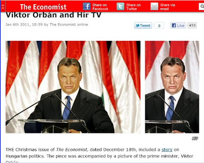
To prove they did nothing wrong the Economist published the original AFP shot and the cropped illustration side by side:

Alas, this was the point where Mr Nippletrait too made a fool out of himself and his paper.

First, anyone with just a little knowledge of photography knows that such cropping in a portrait gives more emphasize to the subject. Whatever he's doing will be more accentuated. Here the face, captured in a stern and not very flattering expression, becomes more predominant just by the tight crop. Moreover, the crop made the green parts of the Hungarian flag disappear and the resulting red-white-black colors might make one think of the Nazi , just in the spirit of an article trying to make Orbán appear as a new Hitler - but OK, maybe that's too much of a conteo.

Second, adjusting skin tones and WB on the face and hair resulted in much harsher facial features and I bet they even pushed the contrasts to achieve this. The result is an even more stern expression that could be easily interpreted as threatening, devilish, evil (you name it) and by adding the punchy caption the editors made sure that even the dumbest of readers understand: here's the bad guy, now hate him for two minutes.

Third (and this is the point where Mr Nippletrait's arguments go fatally wrong): even if we dismiss the above as nitpicking, fact is that with the same effort a less negative photograph could have been chosen. I wanted to upload a gif animation of the whole moment when the picture was taken but screwed it, anyway here's the next frame just a second after the angry look:

Uh-oh... here Mr Orban doesn't look like the devil and that wouldn't fit into the preconception of the Economist's "objective and fair" (cough) article, now would it?

That's the painful point. How can Mr Nippletrait be so naive to presume that readers aren't able to think a step further, and be easily convinced that because they didn't add another nose or Hitler moustache or devil's horns, there was no manipulation here? Picking this particular image alone was manipulation, and an even worse manipulation than that of - namely, a blatant emotional manipulation of the readers themselves. One doesn't need Photoshop to lie with a photograph, a pair of scissors and a good crop will do the job:

Here on the left we see the Al-Jazeera, in the middle the (uhm, that's supposed to be the unbiased fact-based media but none comes to mind) and to the right the FOXNews version of the same event, all captured within a single frame.

OK - all the press does adjust its illustrations to the story it wants to tell (I wish I could take a portrait of Mr Nippletrait picking his nose and adding a caption like "nothing good will come out from there" if for any reason I wanted to show him as an ugly person), but doing that and then claiming that they did nothing wrong is as ridiculous as HírTV's amateurish communication of the matter. As I see it, Mr Nippletrait's lecture about good journalism is an overdose of hypocrysis. Seen it before in the Economist, though... a few years back they published a long article in favour of the Turkish EU accession, illustrated with the photo of a Koran school and a caption "Nothing to be afraid of." Define demagogy, eh?
Just for fairness' sake I admit that their below illustration with Mr Orban looking down at the articles bashing him is totally hilarious:


Anyway, in my opinion we in Eastern Europe still make the mistake of taking Western media too seriously, as if it wouldn't be the same old manipulative instrument of those with power it always was. Ironically, this mess between HírTV and the Economist is just an example how our naivety fools us; after all, the whole thing is just another occasion to see how the press tries to manipulate us. The press manipulates, bankers are greedy, guinea pigs are not particularly bright. Did I tell something new?

Tuesday, January 4, 2011

Fallen legions


They used to scalp Barbarian women to sell their blond hair for wigs, not to mention their tendency "to ravage, to slaughter, to usurp under false titles, and call it empire; and where they made a desert, to call it peace", but I can't help myself to feel kind of a sympathy to the Roman Empire. And there was a caesar called Maximian who, had he been just a little more successful, could have changed the course of history; but he failed, and his image shows just that: a failed man, seeing his world collapse around him.

I always loved this image with all the world-weariness written on his face and for some time entertained the idea to make a similar self-portrait just for my own fun. With the peace of Christmas holidays descending on us I took the time to make it. Ironically, there's a poem titled "With fallen legions" by Hungarian poet Árpád Tóth, in which an aging man, still longing for love but neglected by young and desirable women, compares himself to an emperor still ready for new conquests but having only "fallen legions", a metaphor for being powerless. Not in the sexual way of meaning; at least to me, still far from being powerless, it's about understanding much but not being able to change anything, going far beyond love. And of course seeing a new seed of beauty growing which my generation will never reap. Isn't this ironic: long ago I knew their mothers in their full beauty, and now I see their daughters blossoming? Anyway, the point is that I didn't want to hire professional models, I wanted to have two under-age beauties to emphasize the difference between their fresh faces and my own worn-out look.


So entered Rebeca and Reka, with reflective shields replacing the scutum of Maximian's bodyguards. Originally I wanted to do it with Edd Carlile but he was away, and I still had enough photographic legions to attempt it on my own; in any case, I counted on his portrait expertise but didn't want to do it his way. I admire him but don't want to imitate him. In any case he had made a much better emperor than me.
After the emperor shots I took a few beauty shots of them, which were nothing particular but good exercise.

I screwed some of Reka's pics though by over-stretching de 5D's flash syncron speed but somehow I like those images anyway.

It was a tad difficult with Reka. She will grow into something wild, with more explicit sexuality than usual, and I didn't consider it right to push the shooting into that direction. I wish she had worn a torn leather jacket with sharp metal rivets. Or just smash a window. She rocks, and she definitely should rock. In the good, old-fashioned way. Maybe next time.

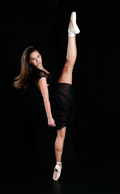
It was easier with Rebeca. Attending a ballet school and prepared for a life on the stage, she was a pleasure to instruct. And I love working with professional ballerinas. Bodies innocent and graceful from far away, but lethal terminators from close enough.

We had some problems in the beginning because the shooting started with me slipping & tearing down the black background fabric. (You know, a good photographer shows to the models what pose he wants them to assume.) I told Rebeca, "jump up and do the splits" which she happily did, only to prove the studio too small.

So, there we stood with Reka (a quite bendy model herself) looking with dropping jaws at Rebeca who seemingly without any efforts assumed the most self-torturing poses, and even when I told her "OK, nice, but now do it again so that I can capture it and don't forget to shake your hair" she did it without any moaning.


Anyway, I'm not so satisfied with this set; there were lots of props we didn't use, Reka got stuck in a not-so-fitting innocence, and the black background, and my own stupidity not to use the stroboscope mode of the 580EXII for the ballet shots - but it was great fun at least. Even though I, the old emperor, couldn't shake off a little envy for the young lucky centurions who might be legally in love with these two beauties.
But in all honesty, I wouldn't want to be in their shoes.